Do I Need A Website Privacy Policy?

If you’ve noticed an increase in companies emailing they’ve updated their privacy policy it’s largely due to the EU (European Union) court case win against Google plus the data mining battle Facebook is facing.  Most of us don’t engage in business with Europe so this isn’t critical, for now.

What has accelerated is the FTC Privacy Laws and California’s own set of rules.
CalOPPA applies to any person or company in the United States (and conceivably the world) whose website collects personally identifiable information from California consumers. CalOPPA requires the website to feature a conspicuous privacy policy stating exactly what information is collected and with whom it is shared; it also requires the operator of the website or online service to comply with the site’s privacy policy. Those who fail to do so are at risk of civil litigation under the state’s Unfair Competition Law.” Read more. California’s ruling applies to US states and any countries whose website visitors are from California.

You’re collecting data if:

    • If you’re using Google Analytics
    • If you collect email addresses for a newsletter, either via your website, mobile app or correspondence
    • Website has a Contact Us Form
    • You email clients
    • You collect Name, Phone Numbers
    • You text clients
  • Your website collects cookies-and all websites do.

For most of us we simply need to state what we collect, steps to keep it confidential, give people an opt-out, state use of cookies and inform users they can turn off cookies in their browsers.  Most is logical and common sense, but it’s required to be stated. If you do have a privacy statement, great – make sure it is updated. I’ve just updated my own. DO NOT TRACK is a new item.  The policy must be in certain locations on your website – easy to find, etc.  Follow the guidelines and eliminate one potential headache for your online presence.

You can Google “Privacy Policy” and find options.  There are websites which will generate a Privacy Policy for you, some free, and sometimes the “free” turns into $48.00 and up.  I found some of the questions asked to be filled in puzzling.  My clients can contact me with any questions and to make this addition to your website.

Privacy Policy for Website

If You’re Not Mobile Ready – You’re Unprepared

The prediction has been in the air for years. But now the stats show that people are searching on the their phones and growing speeds, with no sign of slowing down.  While 71% of businesses see the mobile value 78% of businesses are not mobile ready.  It’s a great advantage to  go mobile right now and stay ahead of your competition.  While many business owners cite cost as an issue most businesses have seen a decline in advertising expenses with the demise of yellow page phone books.  Recognizing a website is now the cornerstone of any and all advertising the shift is beginning.  While pay-per-click is still scary to most business owners investing in your organic website structure is building on solid ground.

Google News for Local Businesses

Recent changes make your Google+ page more helpful to your business.  Google used to display about 7 local businesses in its “maps” section on search results. That number will now be cut to 3 as Google gives more preference to its Google+ pages.  Google set guidelines to optimize the business pages.  Take advantage of it – give Google what it wants, don’t be the business that ignores helpful suggestions from Google.  Too busy to handle this yourself?  Inquire about my Webmaster Services.

Freshen Your Website

If your business is service related make the most of your images.  If your site is more than a few years old at that time keeping images small was the best strategy for user friendly load time on each page.  Now there are many ways to showcase your work with much larger sized images – still optimizing for download speed. There are many options to make your photos interactive (click to enlarge).  Read more.

It’s your website – your business online – grow it, make it shine – freshen it – make it work for you.

Embedded YouTube Video on iPad is Low Quality

You’ve just created your marketing video.  Uploading to YouTube is the best solution for adding to your website.  (You will embed your YouTube video.  YouTube provides the tools for doing this.)

YouTube displays on all platforms saving you the time and aggravation of converting your video to multiple formats, then coding your website to handle all the configurations.  It’s a simple solution.  Beyond that YouTube is owned by Google which strengthens your positioning for…search engines.  Add to that you can configure your YouTube account for keywords and general SEO.  All these advantages are significant.

You test your video, on Macs, PCs, cells and then..the iPad.  On every other device you get the typical YouTube box around your video, allowing the user to view from your website, or go to YouTube; change the quality settings up to the maximum resolution you chose when saving your video file.  Everything works as expected and seamlessly.  Every platform except the iPad.   While a box appears around it with what seem to be links, (just as you see on your PC) these are disabled.  You can make the video full screen to the disappointment of seeing it displayed as the lowest resolution.  Given the expectation of iPad’s video display this is shocking when you first discover it.  But there is no way around it.  Even if you code the embedded link with “video quality” to display 720 it will not improve the quality on the iPad.  Speculation is the Apple hates Google…Google hates Apple battle, but no way of confirming this.  Apple never wavered on allowing Flash, it’s doubtful this scenario will change, either.

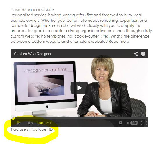
The workaround?  Provide a direct link to your YouTube video below your video specifically for iPad users.  The issue is delivering your video with options of quality for the user.  I’ve since migrated to Vimeo. The screen capture below explains YouTube needs.

web disgner video

Why should I redesign my website?

Thinking about making a change to your website? Your website is your best marketing tool. Its success relies on the amount of attention you put into it.  Search engines look at how often you update your website.

Websites need to evolve continually. The days of create-it-and-leave-it have passed.  Websites which are stagnant year after year fall behind.  With so many businesses actively attending their websites you don’t want to make the mistake of ignoring yours.

So much has changed in the past 2 years online.  As you surf the net you’ve seen wider websites, interactive slide shows and design changes. Consider a fresh redesign and updating your content.  If you like your current design it can be reworked using newer visual layouts and code.  The client below liked his color theme and banner-it now looks fresh.

Add a slide show, add a blog and write short articles, or update the photos on your website. Now we can use much bigger images.  Don’t ignore the value of your FAQs page-update the questions. Offer the information people need to know when they are ready to hire you. The current thinking is to make changes to your website at least every 2 months.

The internet is so visual don’t take a chance on your website looking out of date and losing business to a competitor. Keeping your website fresh and current sends the message your business is thriving.

Original design.

Original design.

Continue reading

Website Slide Show, Gallery

Deciding how to show your products is part of creating your website. Trying to decide the difference and choosing can make your head spin.

A photographer needs his work to be prominent – with the page layout framing his work.  Keeping in mind your website’s performance is critical if you’re looking for organic search engine results. To that end page loading time is a factor. If the slide show or gallery is bloated the website’s performance suffers, and equally important – the user is annoyed.  Here we used a quick loading JavaScript show which allowed more images on the Home page.
JavaScript Slide Show
DouglasSimon.com

The Staging category needed the full breadth of the image. While this meant larger files, we reduced the number of images in the slide show to compensate.
staging photographyDouglasSimon.com

Portrait portrait (versus landscape), thus the difference.  Keep in mind the best display for your product.Executive PortraitsDouglasSimon.com

Presentation can be a fabulous supporting framework for your product.  In this case the whimsical art is beautifully showcased using a book which pages turn.
Book Slide Show, Turn Page
a-lil-whimsy.com

So many choices. When you find something you like send your web designer the link. Enjoy exploring!