If You’re Not Mobile Ready – You’re Unprepared

The prediction has been in the air for years. But now the stats show that people are searching on the their phones and growing speeds, with no sign of slowing down.  While 71% of businesses see the mobile value 78% of businesses are not mobile ready.  It’s a great advantage to  go mobile right now and stay ahead of your competition.  While many business owners cite cost as an issue most businesses have seen a decline in advertising expenses with the demise of yellow page phone books.  Recognizing a website is now the cornerstone of any and all advertising the shift is beginning.  While pay-per-click is still scary to most business owners investing in your organic website structure is building on solid ground.

Google News for Local Businesses

Recent changes make your Google+ page more helpful to your business.  Google used to display about 7 local businesses in its “maps” section on search results. That number will now be cut to 3 as Google gives more preference to its Google+ pages.  Google set guidelines to optimize the business pages.  Take advantage of it – give Google what it wants, don’t be the business that ignores helpful suggestions from Google.  Too busy to handle this yourself?  Inquire about my Webmaster Services.

Freshen Your Website

If your business is service related make the most of your images.  If your site is more than a few years old at that time keeping images small was the best strategy for user friendly load time on each page.  Now there are many ways to showcase your work with much larger sized images – still optimizing for download speed. There are many options to make your photos interactive (click to enlarge).  Read more.

It’s your website – your business online – grow it, make it shine – freshen it – make it work for you.

Google Mobility Deadline

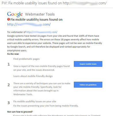
Google’s mobile friendly deadline of April 21st is fast approaching.  Google has been issuing notices for several months like the one below.  Note: You’ll only receive such a notice if you have signed up for Google’s Webmaster Tools.

google-mobile-ready


That’s the good news!  Google hasn’t always been forthcoming in major changes it makes affecting search results, so giving advance notice has been a huge help for website owners.

What does this mean? If your website is a desktop version only and you haven’t created a mobile website your site will take a back seat to all the mobile friendly websites for users on cell phones.  The stats continue to climb for people searching on their phones, which is no surprise since we carry our cell phones everywhere.

This mobility issue also applies to blogs.  Google will flag your blog if the theme isn’t mobile ready.  This information isn’t provided this clearly, but revealed in the details.

Beyond Google there are other issues to consider for your mobile readiness.  Make sure your content is viewable on all devices. Flash won’t play on apple devices. Check all link redirects – make sure these are properly configured.  If all your desktop content is not on your mobile site redirect that page to an associated page and avoid an overload of links to the home page.


Why Should I Redesign My Website?

There comes a time when your website needs to be redesigned.  This usually involves multiple factors.  Code has changed substantially in the past 3 years which provides more options for your website, and  certainly better performance within browsers.  Leaner code means a faster download which is something Google favors in page ranking.  Websites benefit from a fresh view.  Look it over and discuss with your designer what elements can be improved upon, enhanced, things which are obsolete and how to optimize the space to lead the visitor through the website, while keeping navigation ease a priority.  A mobile presence is critical: whether a free-standing, side by side site or a responsive website (requiring a makeover of your old site) you can’t ignore mobile users.

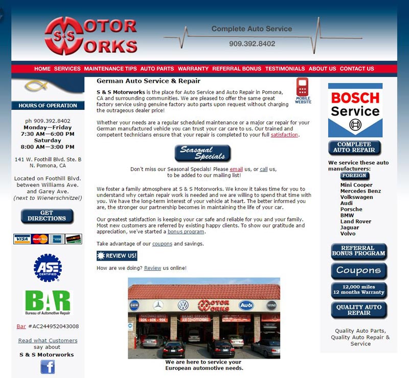
website in need of a redesign

This site served well for its time, when monitors were smaller, dial-up connections were still around, images needed to be as small as possible, beveled buttons and gradients were trendy and 800 pixels was the maximum width the W3 consortium recommended.  Enter the fun.  Now browsers and monitors span much wider screens, large optimized images are easily handled by browsers and bandwidth. And the most fun of all, design has changed using a much broader palette of colors: beautiful bold, flat colors which let the design breathe and make the web page less cluttered while still offering the same key points, call to actions and copy.  Visual matters in marketing.   A website redesign will keep your website ahead of your competition whose sites may be tired and sagging.  A fresh looking website represents your business well to visitors.  It’s your first impression to potential clients – make the best of it.

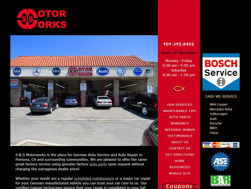
Auto Shop Website Redesigned


Why Update Your Website?

Your website is the cornerstone of your marketing.  Keep presenting the fresh face of your business by updating photos. List new products or services; add new staff members photos and bios. Consider adding information pages or a “What’s New” page to show off your latest projects or products. If you’re ready to move beyond your cell phone camera or point and shoot camera give us a call for professional photography.  Time for a major website overhaul?  Redesign your website.

Email continues to shine as a marketing tool.  97% of cell phone users read email on their phone.  Let your website help you collect email addresses, if you’re using an email client (MailChimp, iContact, etc.) add their website widget to your desktop website, mobile site and blog.  Otherwise collect email addresses as you invoice, or have a signup sheet available.  When you’re ready to announce a special you’ll be ready.  I manage email newsletter campaigns as a service.

Social media is the choice many potential clients use to engage with businesses.  Every business needs a Facebook page and Google+ page. Photographers and artists make use of Pinterest, Flickr; home construction or remodeling try Houzz and Pinterest; auto lovers frequent Instagram.

When you’re ready move into video and make use of YouTube, Vimeo and more.  For help read about my Webmaster Services.

97% of cell phone users go online with their phones.  The single biggest impact for your internet presence is a mobile website.  Make it easy for mobile users to receive your message. Reach people on the platform they choose.

Read more  http://www.pewinternet.org/fact-sheets/mobile-technology-fact-sheet/

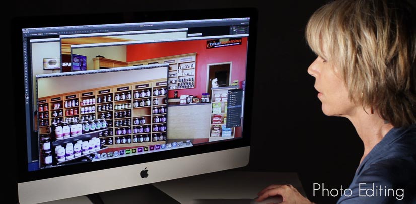
photo-editing-services

Website Marketing 2014

Since the phone directories are all but dead your website is now the cornerstone of all advertising. Everything needs to point to it. Each email should contain an email signature with a link to your website. Print it on your invoices, print ads, coupons and anything you hand out to clients. You can’t overdo driving people to your website.

What can you do to increase your online presence?

If you began your online presence with a ten page website consider expanding. New pages can include detailed information about your services and products. Each page gives the opportunity to drive that page for one keyword – a solid strategy for organic search engine results. The more real estate you use online – the better your website will work for you.

Web design continues to change to reflect trends and follow the internet consortium standards. One of the most obvious visual changes is creating web pages which are far wider than 5 years ago. Widening your website allows more of your message to be seen quicker. Consider reviewing your website for improvement – both design and functionality.

If your website is static (nothing moves) consider adding a slide show. There are so any choices to display your products and services.  More examples: Magnifier (scroll below slide show), Online Magazine/Book with page turning.

Create a video; embed it on your website using YouTube as a search engine to get out your message. Videos of past were often slide shows, but today’s user expects a higher quality video with a solid message. One client
added a video and within 2 months had over 400 views. This adds to your advertising plan.

Mobile websites are a necessity. You can’t afford to miss out internet users who actively use phones and/or tablets. There are several ways to approach a mobile website depending on your budget.

Collect email addresses and keep in touch with your clients via email campaigns.

A new year and a fresh plan may be in order.

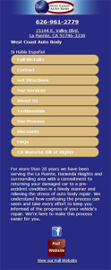
Mobile Website for Auto Body Shop

mobile websiteThere are certain businesses which cannot be without a mobile website. If your services are urgent, or emergency this is a must. There are choices in a mobile website design and structure — the goal is to find what fits your budget and needs. You can redo your existing website to transform to mobile deives with style sheets, but the cost is substantial.  A simpler choice if you have limited content on your website (like a 20-30 page website) is to create a standalone sub-domain, mobile website.  It’s time efficient which translates into cost savings for business owners and will reflect your full website.

Choices!

Do I Need A Mobile Website?

Do I need a mobile website?  It started out as a trend.  We know retail sites are seeing incredibly high traffic increase.  But what about the service industry? If your business garners emergency or urgent services, you risk losing business, already.  All service businesses should not ignore mobile because use is on the rise across all industries.  As mobile use rises continually a mobile ready website needs to be in your plan.

Statistics tell us mobile phone web users are “task oriented”.  Their searching is more likely to convert to action.  Mobile use varies on preference and also their bandwidth phone service plan.  Mobile websites are highly optimized for download speed, using far less bandwidth than your full website.  If a user’s preference is a mobile site, they likely will bounce off your full website in search of a lean mobile site.  Having a mobile presence is about improving the customer experience.  Don’t give a visitor a reason to leave once they have found you.

I have found the best course of action gives the control to the user.  Your mobile website is triggered when a visitor lands on your full website via a mobile device.  A link to view your full website is prominently displayed, and also a link to your mobile website is on your full website, should they choose to go back and forth.

While staying on the cutting edge and following every new device can be very expensive (thousands, tens of thousands) to maintain there are several other approaches far less costly, especially for website owners with small websites (20 pages and less).  It’s time.

Photographer’s Mobile Website

The object of a mobile website is to be very lean.  It reminds me of the days of dial up internet connections when web designers squeezed every pixel in an image as small as possible.  Mobile means lean — and not only shrinking images, but only using when necessary.  Once you have a banner – you’re left with little precious real estate for graphics.

So, what to do with a photographer’s mobile website, when his business is visual?  We decided on one image per page, with a main gallery page listing/linking to each photographic category (business photos, portraits, real estate, etc.) gallery page.  This gave the visitor a heads-up to know clicking through they would be viewing/downloading images.  Being respectful is important in creating a mobile website.  This offered the limited-bandwidth user a chance to opt out – or bookmark to view on their desktop.

Each gallery page has a maximum 6 images, and these were highly optimized.  It gives the user an idea of the photographer’s style and feel without a big bandwidth use.

Both the desktop site and mobile site easily let the user switch back and forth if bandwidth is not an issue.

mobile website