Why Should I Redesign My Website?

There comes a time when your website needs to be redesigned.  This usually involves multiple factors.  Code has changed substantially in the past 3 years which provides more options for your website, and  certainly better performance within browsers.  Leaner code means a faster download which is something Google favors in page ranking.  Websites benefit from a fresh view.  Look it over and discuss with your designer what elements can be improved upon, enhanced, things which are obsolete and how to optimize the space to lead the visitor through the website, while keeping navigation ease a priority.  A mobile presence is critical: whether a free-standing, side by side site or a responsive website (requiring a makeover of your old site) you can’t ignore mobile users.
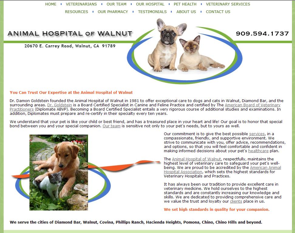
website in need of a redesign

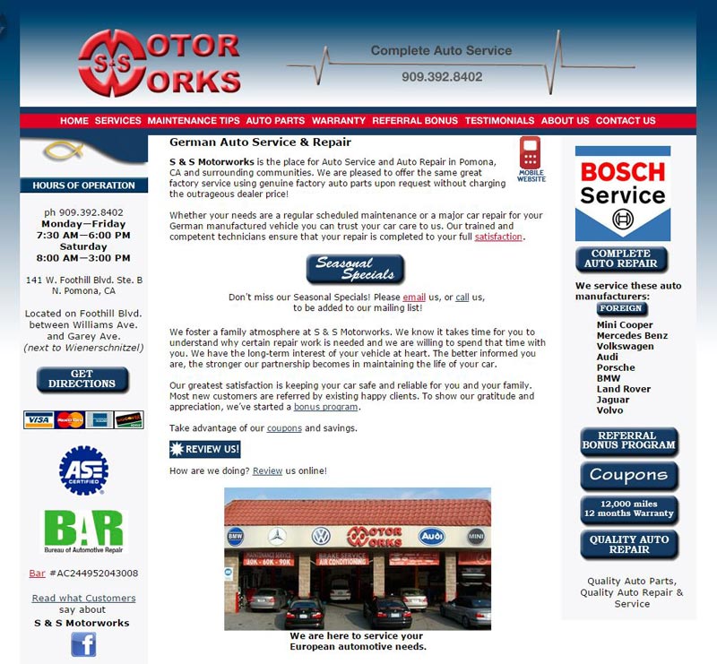
This site served well for its time, when monitors were smaller, dial-up connections were still around, images needed to be as small as possible, beveled buttons and gradients were trendy and 800 pixels was the maximum width the W3 consortium recommended.  Enter the fun.  Now browsers and monitors span much wider screens, large optimized images are easily handled by browsers and bandwidth. And the most fun of all, design has changed using a much broader palette of colors: beautiful bold, flat colors which let the design breathe and make the web page less cluttered while still offering the same key points, call to actions and copy.  Visual matters in marketing.   A website redesign will keep your website ahead of your competition whose sites may be tired and sagging.  A fresh looking website represents your business well to visitors.  It’s your first impression to potential clients – make the best of it.
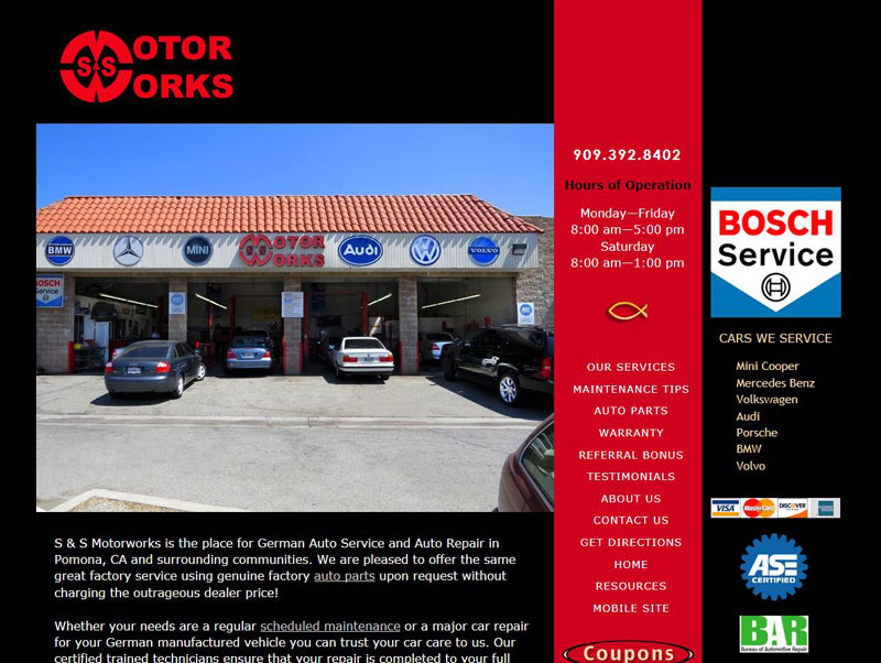
Auto Shop Website Redesigned


Website Slide Show, Gallery

Deciding how to show your products is part of creating your website. Trying to decide the difference and choosing can make your head spin.

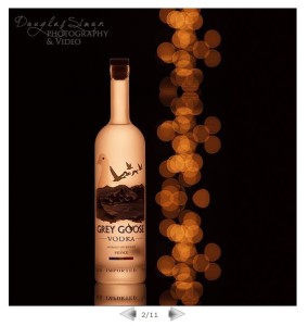
A photographer needs his work to be prominent – with the page layout framing his work.  Keeping in mind your website’s performance is critical if you’re looking for organic search engine results. To that end page loading time is a factor. If the slide show or gallery is bloated the website’s performance suffers, and equally important – the user is annoyed.  Here we used a quick loading JavaScript show which allowed more images on the Home page.
JavaScript Slide Show
DouglasSimon.com

The Staging category needed the full breadth of the image. While this meant larger files, we reduced the number of images in the slide show to compensate.
staging photographyDouglasSimon.com

Portrait portrait (versus landscape), thus the difference.  Keep in mind the best display for your product.Executive PortraitsDouglasSimon.com

Presentation can be a fabulous supporting framework for your product.  In this case the whimsical art is beautifully showcased using a book which pages turn.
Book Slide Show, Turn Page
a-lil-whimsy.com

So many choices. When you find something you like send your web designer the link. Enjoy exploring!

Custom Website vs Template

Too many clients come to me after trying a template website, or do-it-yourself company. They are completely frustrated and often have spent too much money either not completing the site, or letting it go month after month and paying a sizable monthly fee.

Template sites from  major telecommunication companies (Yellow Book, AT & T, Supermedia) sound simple for a busy business owner, and do-it-yourself/create-your-own-website companies sound promising to ge you up and running in hours.

There are times when these might be ideal for business owners who are aggressive in learning basic code, SEO and photo editing, or needing something up quickly while developing a custom site.  Here is a side by side comparison to help you find clarity in what to choose.
custom website vs template


http://www.brendasimon.com/custom-website-vs-template-website.html

Veterinarian Website

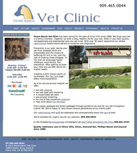
Had fun with this website. The blue works nicely for the pet medical field. Payne Ranch is a small clinic, but has a long history in Chino Hills. A simple ten page layout worked well for their content.

Veterinarian Custom Website

Veterinarian Custom Website

Photos by Douglas Simon Photography

Does Website Design Matter?

There is a constant stream of advertisements for “create your own website” for free, after 30 days pay only $7.99/month or simple sounding ads like “Design your website in minutes.”

It’s sounds so easy and the price sounds unbeatable.  In the early days of the internet this might have been just the tool for many businesses.  As a web designer who codes these templates are cumbersome to use. For the novice they require a lot of time and frustration to learn the software.  You will still need your content: photos and page copy.  Your photos need to be optimized to download  quickly, so you need some photo editing skills and learn how to choose what compression is best.  You need to spend time learning at least some basic search engine optimization (SEO) and learn about meta data to compete for organic results.  All of the above are the nuts and bolts of using a template website.

Websites need “call-to-actions” which are eye appealing and well placed.  Navigation needs to be simple – easy to figure out so customers can quickly find what they are looking for.  Frustrated visitors won’t become your client.

Beyond all the code and functionality, yes, design matters.  A welcoming website sets a tone for your business, the same as a showroom displays your products.  The layout and design bring all the elements together.  The bottom line is people will judge your business based on the looks of your website.  Statistics reveal over 90% of people said they trusted or mistrusted a website based on design alone, less than 10% said it was content.

It’s much like packaging of food.  Yes the generic brand is cheaper, but the jar/box isn’t nearly as creative as the name brands, who give great thought and expense to their brand.

While it doesn’t have to be award winning you want your design to send a message of trust, professionalism and quality.  You know your business, hiring a professional to create your website is a good investment.

Website Marketing

Your website has become the cornerstone of your business.     All roads of marketing point to your domain.

Website RedesignIt’s not uncommon to want a new look for your website. A “refresh” can be the solution. Change photos, add a JavaScript slide show, update the page content and a critical step: review the SEO. Google changes rules more than 500 times in a year.

Thinking about blogging? A blog is a huge asset to driving your website. You know your business, who better to write short articles and post periodically? Sites adding new relevant content are seen as reliable and this, in turn, improves your rankings. A blog on your website is an easy way to add regular content while expanding your web presence. Give me a call if you have any questions. ph 909.595.0610


Mobile MarketingIt’s hard to ignore the usefulness of “going mobile”. Our phones have created a new market place for businesses.

Your mobile website needs to feature the most important aspects of your desktop website in the most user friendly way with quick download time. Equally important is giving the user a quick way to view your full website and avoid a frustrated user experience.

Give me a call if you have any questions. ph 909.595.0610

Online Reviews Your online reputation is part of your internet presence. It’s an opportunity to engage with customers via websites they trust to to be accurate.

You may get negative reviews, but you can turn this into a positive, by addressing any issues. The fact your business has responded to a negative review  often is the tipping point for a potential customer. It’s an opportunity to  build customer confidence in you and your company.

I have created Webmaster Services to help you fine tune your online presence to make it a more effective marketing tool. Give me a call for more details, or read online.

Website Design Colors

When it comes to designing your website color is the first decision. If you have a logo you have already established a branding, perhaps.  You can still work a new color theme around your logo for a new look.

Here a simple easy to understand article on color use for your website.  You may change the colors of your walls at home, too!

Here we added splashes of vibrant color, for effect without overpowering the visitor’s eyes.
veterinarian website

Google Instant

It’s been a year of changes to the web. Google has rolled out new ways to search, intuitive ways it thinks we’re searching, local search, Google Maps becoming Google Places with the “tag” available for $25.00/month and Google Instant.

Probably the biggest change has been what happens when you begin to type in Google’s search bar. Instantly you are seeing possibilities.  Once you hover over a website listing you’ll see preview of the website. You don’t even have to click the link.

As a web owner this has significant meaning. The sooner the user can see your web page – the more chance they will click through to your website. If you are using Flash (entire website, or slide shows, moving graphics) – you now have a lag time for the page loading, and risking it not previewing accurately.  Cluttered web pages and small tiny graphics become a blur. Keep your website design simple and bold. It will be readable on a small scale, for this preview. A simple website also will view on mobile phones will less issues. My oldest client’s website is extremely lean and trim – as browsers have evolved we have had virtually no compatibility issues and the site continues to display with speed. 

Simple web design has another plus. 2010 was the year Google owned up to what was guessed for years: how quickly your website downloads (speed) DOES matter for its index/ranking. Once again the simple website will have an advantage.

Ever notice that Amazon’s design remains old school – basic web design? It will display on phones, quickly on desktops, iPads – no conflict and speed is never an issue.

It’s a win-win design!