Electronic Media Marketing

Your CRM marketing system is a great tool.  Take a step ahead of your competition and stop using templates in your dashboard.  Take control of your message both textually and visually.  The same graphic idea can be created for your social media which solidifies your brand. This became a newsletter, flyer, poster and a Facebook banner.
Facebook Banner:Electronic Media Marketing

Electronic Newsletter, Flyer and Poster:

Social Media Marketing and Print Ads

Why Should I Redesign My Website?

There comes a time when your website needs to be redesigned.  This usually involves multiple factors.  Code has changed substantially in the past 3 years which provides more options for your website, and  certainly better performance within browsers.  Leaner code means a faster download which is something Google favors in page ranking.  Websites benefit from a fresh view.  Look it over and discuss with your designer what elements can be improved upon, enhanced, things which are obsolete and how to optimize the space to lead the visitor through the website, while keeping navigation ease a priority.  A mobile presence is critical: whether a free-standing, side by side site or a responsive website (requiring a makeover of your old site) you can’t ignore mobile users.

website in need of a redesign

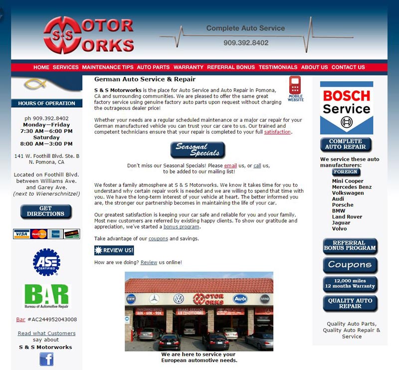
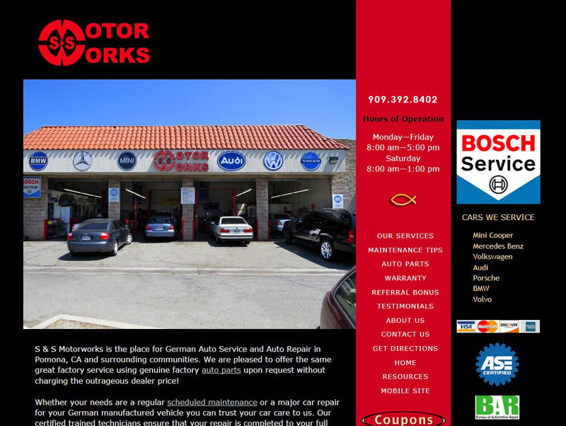
This site served well for its time, when monitors were smaller, dial-up connections were still around, images needed to be as small as possible, beveled buttons and gradients were trendy and 800 pixels was the maximum width the W3 consortium recommended.  Enter the fun.  Now browsers and monitors span much wider screens, large optimized images are easily handled by browsers and bandwidth. And the most fun of all, design has changed using a much broader palette of colors: beautiful bold, flat colors which let the design breathe and make the web page less cluttered while still offering the same key points, call to actions and copy.  Visual matters in marketing.   A website redesign will keep your website ahead of your competition whose sites may be tired and sagging.  A fresh looking website represents your business well to visitors.  It’s your first impression to potential clients – make the best of it.

Auto Shop Website Redesigned


Building a Stronger Online Presence

Your website is the cornerstone of your marketing.  Keep presenting the fresh face of your business by updating photos. List new products or services; add new staff members photos and bios. Consider adding information pages or a “What’s New” page to show off your latest projects or products. If you’re ready to move beyond your cell phone camera or point and shoot camera give us a call for professional photography.  Time for a major website overhaul?  Redesign your website.

Email continues to shine as a marketing tool.  97% of cell phone users read email on their phone.  Let your website help you collect email addresses, if you’re using an email client (MailChimp, iContact, etc.) add their website widget to your desktop website, mobile site and blog.  Otherwise collect email addresses as you invoice, or have a signup sheet available.  When you’re ready to announce a special you’ll be ready.  I manage email newsletter campaigns as a service.

Social media is the choice many potential clients use to engage with businesses.  Every business needs a Facebook page and Google Business  page. Photographers and artists make use of Pinterest, Flickr; home construction or remodeling try Houzz and Pinterest; auto lovers frequent Instagram.   When you’re ready move into video and make use of YouTube, Vimeo and more.  For help read about my Webmaster Services.

97% of cell phone users go online with their phones.  The single biggest impact for your internet presence is a mobile website.  Make it easy for mobile users to receive your message.

Reach people on the platform they choose.

Read more    http://www.pewinternet.org/fact-sheets/mobile-technology-fact-sheet/

Why should I redesign my website?

Thinking about making a change to your website? Your website is your best marketing tool. Its success relies on the amount of attention you put into it.  Search engines look at how often you update your website.

Websites need to evolve continually. The days of create-it-and-leave-it have passed.  Websites which are stagnant year after year fall behind.  With so many businesses actively attending their websites you don’t want to make the mistake of ignoring yours.

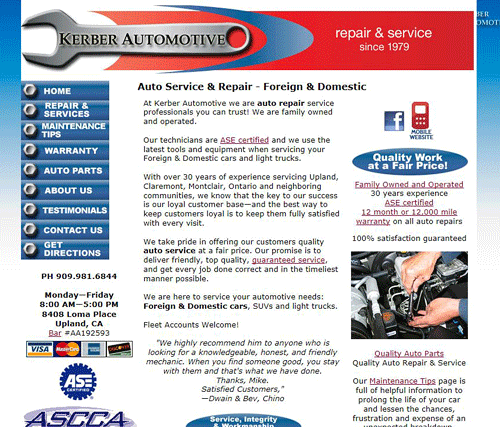
So much has changed in the past 2 years online.  As you surf the net you’ve seen wider websites, interactive slide shows and design changes. Consider a fresh redesign and updating your content.  If you like your current design it can be reworked using newer visual layouts and code.  The client below liked his color theme and banner-it now looks fresh.

Add a slide show, add a blog and write short articles, or update the photos on your website. Now we can use much bigger images.  Don’t ignore the value of your FAQs page-update the questions. Offer the information people need to know when they are ready to hire you. The current thinking is to make changes to your website at least every 2 months.

The internet is so visual don’t take a chance on your website looking out of date and losing business to a competitor. Keeping your website fresh and current sends the message your business is thriving.

Original design.

Original design.

Continue reading

Veterinarian Website

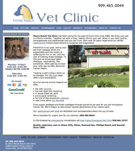
Had fun with this website. The blue works nicely for the pet medical field. Payne Ranch is a small clinic, but has a long history in Chino Hills. A simple ten page layout worked well for their content.

Veterinarian Custom Website

Veterinarian Custom Website

Photos by Douglas Simon Photography

Mobile Website

With the release of the iPhone5, once again, mobile websites are spotlighted.  The huge sales of mobile phones remind us of another opportunity for business advertisement.

The beauty of many Smartphones and iPhones is the way you can view most full websites.   But when your mobile phone plans don’t allow unlimited data use the user will be glad to have the option of viewing a mobile website.  My own mobile website is a brief touchstone.

A mobile website is designed to keep everything small – no large graphics; but more importantly  to get your contact information immediately in front of the visitor with phone numbers clickable, maps directly linked to Google.  Using the tools to help the client to connect with your business easily.

If your business has emergency issues – auto related, medical, dental, etc. – a mobile website can reach yet more people on their phones quicker.

As your business grows online a mobile website is another piece of the plan.

Google Trends

As small business owners you need advertising, and so become inundated with calls soliciting your ad dollars.

The phone book has been dead for some time. Read this article from American Express, dated Nov. 2009! 

How do you decipher where to put your ad dollars?

The above article mentions Yelp. Yelp began slowly years ago as an online directory. If you have been in business for more than 5 years you are probably already listed. Years ago I began suggesting clients fill out a free listing on Yelp and including their website address, photos and other info. But Yelp has succeeded in moving ahead of the pack of online directories and is a viable player.

Google trends allows you a real look at comparisons. Once you arrive: type in: yelp, yellowpages, manta

(Don’t forget the commas)

You’ll see a graph of how each is doing. You can do this for any of the sources soliciting your ad dollars: supermedia, etc. You can finally see how well a company is doing, and by using a comparison you’ll finally have some idea how much of the online market they are reaching.

Google is terrific at giving us tools – they love data!!