Deciding how to show your products is part of creating your website. Trying to decide the difference and choosing can make your head spin.
A photographer needs his work to be prominent – with the page layout framing his work. Keeping in mind your website’s performance is critical if you’re looking for organic search engine results. To that end page loading time is a factor. If the slide show or gallery is bloated the website’s performance suffers, and equally important – the user is annoyed. Here we used a quick loading JavaScript show which allowed more images on the Home page.

DouglasSimon.com
The Staging category needed the full breadth of the image. While this meant larger files, we reduced the number of images in the slide show to compensate.
 DouglasSimon.com
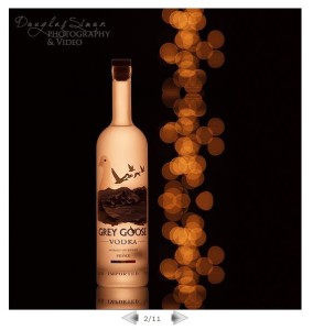
Portrait portrait (versus landscape), thus the difference. Keep in mind the best display for your product. DouglasSimon.com
Presentation can be a fabulous supporting framework for your product. In this case the whimsical art is beautifully showcased using a book which pages turn.

a-lil-whimsy.com
So many choices. When you find something you like send your web designer the link. Enjoy exploring!
